Consider the old system. You have different food "groups" like meats, vegetables, dairy, etc., with the most important group forming the bottom, or "base," of the pyramid. But here's the tricky part: the pyramid if full of words. Words spelled out with letters. Letters, for God's sake! Excuse me, Food & Drug Administration, but I didn't come hear to pass a reading test, I came her to eat, dammit!
Herein lies the genius of the new system. Drawing on the success of the Homeland Security threat system, the new food pyramid uses colors. Accessible, easy to understand, colors. Eating is no longer just for the English-speaking, literate Americans ( i.e. liberals and their activist/homosexual judges), it's for everyone. This is democracy at its finest.
Q: "But what if I'm blind and I can't see anything, how am I supposed to know what to eat?"
A: "You'll eat whatever the hell I put in your cage, dammit."
Some critics charge that the new system is more "confusing" or "difficult" than the old system. Some critics also have "shit for brains." But I digress. Under the old system, if you wanted to know what food group a food was in--for example, yogurt--you needed to think. You needed to think about whether yogurt came from a cow (dairy group), whether it had seeds (fruit group), or whether it was spore-based (meats & vegetable group). But with beautiful new (techni)color system, you need only associate a food with a color.
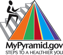
Take a look at the new rainbow pyramid. Orange stands for grains, Green stands for vegetables, Red for fruits, Yellow for oils, Light Blue/teal for dairy, and Indigo for meats & beans. So what color is yogurt? If it's plain yogurt, it's white. That color isn't in the food pyramid, so you shouldn't eat it. If it's flavored yogurt, say, blueberry, it's probably some sort of a bluish-purple. If it's more blue than purple, it's in the Dairy group, and if it's a darkish purple, it's in the Meats & Beans group. Then I want you to ask yourself: do you really want to eat a Meat & Beans yogurt? I didn't think so. Find a different colored yogurt and start again.
"Wow, the new rainbow pyramid is so easy to use, why didn't they think of that in the first place?"
Good question. When the original monochrome food pyramid was released in 1992, the world was a different place. Buffalos roamed free throughout the Midwest, presidents were free to engage in acts of extra-marital fellatio, and a little thing called "focus groups" had yet to be invented. As noted in the official Mypyramid.gov website:
As part of the design and development process, potential images and messages were tested with consumers to determine how well they communicated the intended content and how appealing they were to consumers. The results from the consumer research were used to revise and finalize the consumer materials so that consumers can more easily understand these messages and incorporate them into their lifestyle.
In other words, pretty colors test well. Hence the updated and more scientific color pyramid.
"But wait? With the old food pyramid, I knew the group at the bottom was more important than the group up top. With the new system, how do I tell what group is most important? This rainbow has no bottom. For the love of God this rainbow has no bottom!"
First off, I'm not going to answer your question unless you put some pants on. Secondly, the new pyramid doesn't even need a bottom. The bigger the sliver of color, the more important. See the picture below for details:
"OK, I see the Yellow group is the smallest, and the Indigo one looks a bit smaller than the Red. But I think the Green and teal are about the same size. Why not do some other design like a graph or pie chart?"
Another good question, but the good folks at MyPyramid are one step ahead of you. As they note, "Several designs were tested. Pyramid-shaped designs, Pyramid-like designs and non-Pyramid designs were all tested with consumers."
You see that part about "non-Pyramid designs," smart-ass. They tested it and it failed. Failed miserably, in fact. When the non-pyramid design was tested on the focus group, they were so confused they were eating 20 serving of cottage cheese a day, and drinking a glass of marinara sauce with each meal.
"OK, you've convinced me that the new color-based pyramid is more efficient than the old one, and it seems like even a Swede could understand the new version. But what about that man climbing the stairs in that picture? Is that supposed to symbolize something?"
Actually, no. He's just lost.
(Same post, different blog)

No comments:
Post a Comment